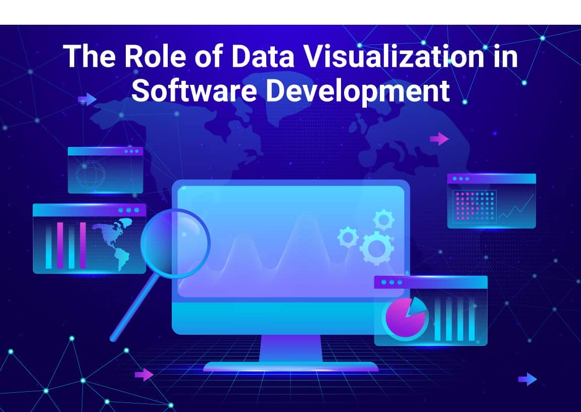
Data visualization helps software developers understand complex information by presenting it in a clear and visual format. Instead of analysing long lists of numbers or raw data, developers can use charts, graphs, and diagrams to spot patterns, track progress, and make informed decisions.
It plays a key role in debugging, performance monitoring, and user experience design. With the right visual tools, teams can identify issues faster, improve software quality, and communicate insights more effectively.
In this article, we will mention the role of data visualization in software development services and how it helps developers work more efficiently.
How Data Visualization Helps in Software Development
Data visualization in software development makes it easier to interpret complex data through charts, graphs, and dashboards. It helps developers identify issues, track progress, and optimize performance efficiently. Here are the key benefits of data visualization software:
Identifying Bugs and Performance Issues
When programs run or act up, a company that makes data visualization software needs to figure out why fast. Instead of going through thousands of log entries by hand, tools like heatmaps and performance dashboards help spot patterns and weird stuff more. Take a performance dashboard – it can show CPU use, memory use, and how fast servers respond right now. This lets developers see where things are getting stuck.
Heatmaps are also useful for debugging front-end issues. If users report that a web page is freezing, a heatmap of user interactions can reveal whether certain buttons or features are causing delays. Similarly, log analysis charts can highlight spikes in error frequencies. This allows developers to focus on specific problem areas instead of wasting time searching through raw logs.
Tracking Project Progress
Keeping track of project progress is critical in software development, especially when working with tight deadlines and multiple team members. Instead of relying on long status reports, teams use visual tools like burn-down charts, Gantt charts, and Kanban boards to get a clear view of where things stand.
A burn-down chart shows how much work remains in a sprint, helping Agile teams quickly see if they are on track or falling behind.
Gantt charts provide a structured timeline of tasks, making it easier to spot dependencies and avoid delays. Kanban boards give teams a real-time overview of tasks in progress, completed work, and upcoming priorities.
If a task is stuck in one column for too long, it signals a possible roadblock that needs attention. By using these visual tools, teams can stay organized, identify bottlenecks early, and ensure steady progress throughout the development cycle.
Analysing User Behaviour
Knowing how people use software plays a key role in making it more user-friendly and engaging. Rather than just asking for opinions or making guesses, a specialized data visualization software firm uses heatmaps and session recordings to see where users click, scroll, and spend their time.
A heatmap shows user activity by highlighting the busiest and quietest parts of a webpage or app. If a call-to-action button sits in a cold (low-activity) area, it might mean users don’t notice it. This could lead developers to change its spot, size, or color to make it stand out more.
Session recordings go a step beyond this by capturing real user actions, showing trouble spots like confusing navigation or form fields people give up on. If users often hover over an input field but don’t fill it out, there might be an issue with the instructions or the information they need to provide.
Improving API Monitoring
APIs are the backbone of many software applications and keeping them running smoothly is a top priority. Instead of manually checking logs or waiting for user complaints, developers rely on use cases of data visualization software, such as real-time API response graphs and monitoring dashboards, to track performance.
These visual tools display key metrics like response time, error rates, and request volumes, helping teams detect issues before they impact users. If a sudden spike in response time appears on the dashboard, it could indicate server overload, a database issue, or a slow third-party service. This allows developers to investigate and resolve the problem quickly.
Error rate tracking is another crucial aspect of API monitoring. A sharp increase in failed requests might point to authentication problems, incorrect API endpoints, or system downtime. By setting up alerts based on these visual insights, teams can fix issues before users even notice.
Strengthening Security Monitoring
Keeping software secure requires constant monitoring, and security dashboards make this process more efficient. Instead of manually reviewing logs for suspicious activity, developers use visual security dashboards to track login attempts, failed authentications, and unusual access patterns in real-time.
If a dashboard shows multiple failed logins attempts from the same IP address, it could indicate a brute-force attack, prompting developers to block the IP or enforce additional security measures like CAPTCHA or multi-factor authentication.
Unusual access patterns can also be a red flag. If a user who typically logs in from one country suddenly accesses the system from multiple locations in a short period, it might signal a compromised account. Security heatmaps and anomaly detection graphs help identify such threats early. Thus, custom data visualization software allows teams to respond quickly, prevent data breaches, and keep user information safe without relying solely on reactive security measures.
Summing Up!
Data visualization in software development significantly simplifies the process for developers to comprehend and deal with tough data. Rather than going through codes, visual aids such as dashboards, heatmaps, and charts are used by teams to identify bugs, performance monitoring, progress tracking, user behaviour analysis, and API reliability and security. When the information is clear and immediate, developers can solve issues quicker, be more decisive, and thus produce better software.
In a software system where the complexity is constantly increasing and where a suitable dedicated data visualization tool is especially appreciated, achieving data visualization becomes a must. It enables teams to be coordinated, collaborate effectively, and react to the beginning of the problems. Bringing the data in for analysis and making it actionable visualization tools helps to smooth the development workflow and bring about the best user experience.

