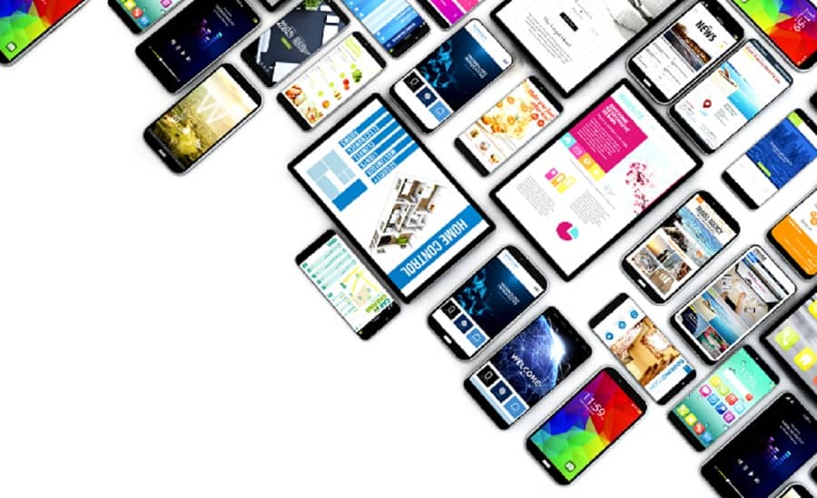
User Interface design in software engineering is one of the most important aspects of custom software development. It is the front-line interface the user interacts with. “First impression is the last impression.”
Over 90% of users leave the pages with bad performance, and over 80% of them never return to the same page again. That’s one of the reasons it often gets overlooked by software engineers.
However, a well-designed user interface can make or break a software product’s success. For an engaging design, here are 5 powerful tips from the developers of Intetics.com you should know.
1. Understand Your Users
First thing first! It’s highly important to know for whom you are creating the design. Are they professionals, only students, old citizens, or all adults? Take the time to understand your target audience to gain user personas to understand their needs, preferences, and behaviors.
2. Keep it Simple with Consistency.
Try to keep it as simple as possible. No matter how powerful your software is, if the end-user isn’t able to use it, there is no use. It will be neglected in no time.
Avoid clutter and unnecessary elements that can confuse users. A clean and straightforward interface is often more effective in delivering a clear message.
Maintain uniformity in color schemes, fonts, and layout throughout your interface so users can go through your application or website with ease.
3.Color Palate
Select a compatible color scheme that aligns with your brand colors and is visually pleasing.
You can create a color combination that resonates with the logo. Uber, Instagram, Facebook, and Canva are some highly popular big brands that follow the same strategy.
Also, be mindful of the psychological impact of colors. You can’t choose red color for the “Yes” buttons or green for the “No” buttons. Check for the meanings of various colors. For instance, blue conveys trust, while red can indicate urgency or importance.
For great color feedback, make sure the A/B testing is done in the right manner. Test different color variations for CTA buttons, notifications, and other UI elements to optimize your design.
4. Font Matters
Always prioritize readability in user Interface design in software engineering. A good readability comes with good fonts. Follow these tips to use fonts adequately:
Complexity: Avoid using decorative or overly complex fonts that are hard to read.
Size of Font: Too small can strain the eyes, while too large may disrupt the layout. Use a consistent and different font size hierarchy, font weights, and styles for all headings, subheadings, and body text.
Line Spacing: Pay attention to line spacing (leading). Inadequate spacing between lines can make text look crowded and challenging to read.
Contrast: Ensure there is sufficient contrast between the text and its background. Low contrast can make text hard to read, especially for visually impaired users. Accessibility guidelines typically recommend a contrast ratio of at least 4.5:1 for normal text. Use relative units like ems or percentages rather than fixed pixel values.
Font Compatibility: Ensure that the chosen font is compatible with different devices and browsers. Some fonts may not render well on all platforms, leading to display issues.
Language Support: If your application or website serves a global audience, ensure that the selected font supports the characters and diacritics of multiple languages.
Font Licensing: Pay attention to font licensing. Ensure you have the appropriate licenses to use the fonts in your project, especially if you are using custom or premium fonts.
Font Pairing: Pair fonts thoughtfully. Combining fonts from different font families can create visual interest but ensure they complement each other and maintain a cohesive look and feel.
However, using too many fonts can lead to a cluttered and disorganized design. Stick to a maximum of two or three fonts.
You can perform User Testing and A/B Testing to determine which options result in better user engagement and readability.
5. Layout Logic

A busy layout can easily overwhelm users. They will simply leave your website or app if they find any difficulty in finding the information they need. So, it’s important to apply some layout logic like sufficient space, consistency, avoiding complex grid layouts, mobile view optimization, and a clean navigation menu.
- Place the most critical information, targeted content, and CTAs above the fold (visible without scrolling).
- Use some important elements, such as headlines, whitespace, grid systems, and calls to action, to guide users through the content.
- Arrange content logically, keeping the user flow in mind. Consider eye-tracking patterns like the F-pattern or Z-pattern to structure your layout effectively.
- Optimize your layout for fast loading times. Minimize large images and excessive animations that can slow down your page.
- Use asymmetry thoughtfully to draw attention to specific elements.
- Group related elements together. For instance, place related form fields within a container and group related menu items under appropriate headings.
- Use alt text for images, provide text descriptions for non-text content, and follow accessibility guidelines (e.g., WCAG).
- Ensure your UI adapts to various screen sizes and orientations, including mobile devices, tablets, and desktops.
10 Apps to Get Inspired for User Interface Design in Software Engineering

- Uber
- Starbucks
- Night Owl Coffee
- Instacart
- Calm
- Duolingo
- Amazon
- Smart Pharmacy
- Canva
In The End
The world of software development will keep growing, as well as user demands. So, stay updated with all the design trends, but don’t follow them blindly. Intetics always suggests our designers and custom software developers incorporate trends that align with brand and user expectations.
It is also important to get consistent feedback. Because if you’re getting feedback, it means your targeted audience is actually using your software. So, don’t lose hope if you are getting negative feedback initially.
Take multiple meetings and discussions with your team and work on future upgrades. This helps in improving the user experience over time. If you want to explore more about user interface design in software engineering, visit intetics.com!
Thanks for reading here! Have a nice day!


